Advanced Visualization Features for Java
Go beyond text and numbers to enhance the data visualization experience for end users.
With Perforce JViews, you’ll get the industry’s most comprehensive set of Java visualization software tools that can reduce development time by 50-80%. Features include:
- Full use of Swing and Java 2D
- Complex charts and graphs
- High-performance displays
- Reducing development time by 50-80%
Key Features for Java Visualization
Perforce JViews Software for Java visualization includes countless features to simplify GUI development.
Graphical Components
Build highly graphical and intuitive user interfaces with Perforce JViews advanced graphical components, including:
Charts: Fed by a series of data points, the curves can show both historical data and real-time values
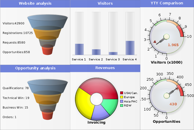
Dashboards: A set of components (charts, gauges, and maps) graphically grouped to represent the business metrics
Diagrams: To represent graphs common in flowcharts, organization charts, network topologies, and process models
Maps: For geographical information systems (GIS) to represent the physical locations
Gantt Charts: These specialized chart components show resource allocation and task schedules over time
Maps for Defense
Perforce JViews Maps for Defense provides custom map displays for military applications using:
3D Map Visualization: Display terrain in 3D through advanced techniques for adaptive terrain refinement and OpenGL-based hardware acceleration
Military Map Readers: Supports multiple data formats, including military map data in land, air, and naval formats
Pre-Built Military Symbols: Includes most standard military symbol sets and include prebuilt graphic objects representing NATO APP-6a/MIL STD 2525B symbols
Terrain Analysis: Extensible 2D analysis of the terrain including visibility zone, line of sight, gradient computation, elevations, and more
Telecom Graphic Objects
Build operations support systems interfaces with this complete set of customizable components, including:
Java Components: Display networks, service and hardware, geospatial and topological network views, equipment representations, and table and tree views
Graphical Objects: Designed in collaboration with experts, providing a unified look and feel that has been adopted by leading industry vendors
Software Development Kit (SDK): Enables customization of components, user interactions, and data connections
Data-Aware Components: Directly pluggable into network or equipment monitoring systems
Get Started With Perforce JViews
Fill out the form to speak with an expert about how Perforce JViews can enhance visualization for your Java application.