Digital Typography:
EYEBROW
H1 Headline
Back to topH2 Subhead
H3 Sub Subhead
H4 Formatting
H5 Formatting
H6 Formatting
Paragraph Text (regular, bold, italic)
- Bulleted list A lorem ipsum dolor sit amet conseceteur
- Bulleted list B
- Bulleted list C
- Numbered list A
- Numbered list B
- Numbered list C
Quote Formatting
Code Snippet Formatting
| Heading | Heading2 | Heading3 |
| Lorem ipsum dolor sit amet, consectetur adipis do | Lorem ipsum dolor sit amet, consectetur adipiscing elit, sed do | Lorem ipsum consectetur adipiscing elit, sed do |
Page Type Examples:
Homepage 1Homepage 2Homepage 3
Solution Page 1Solution Page 2Solution Page 3
Product Page 1 Product Page 2Product Page 3
Subproduct Page 1Subproduct Page 2Subproduct Page 3
Resource Page 1Resource Page 2Resource Page 3
Blog Page 1Blog Page 2Blog Page 3
Press Release Page 1Press Release Page 2Press Release Page 3
Webinar/Event 1Webinar/Event 2Webinar/Event 3
Change Log:
- 8/13/25: Added "Compound - Icon Callouts" component
- 9/18/25: Added "Compound - Tabs" component
- 2/5/26: Added "Book" Resource content type
- 2/13/26: Added "Book" Resource style guide
- 3/23/26: Added "DevOps Stack Layouts" page
Brand Essence / Intro Text H2 Placed Here
This is the default formatting for introductory text aka "Brand Essence" text. This can be adjusted to a variety of width combinations (25/75, 33/66, 50/50, etc.) to accomodate any number of text length. The background should always be white and the text should always be dark. No links, images, or backgrounds will be included in this component.
Basic Text/Image/Video Layouts
Modular, flexible layouts for your content.
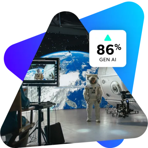
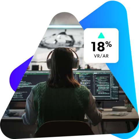
You can insert videos or images at any size along with text, for any number of columns (1, 2, 3, 4, 5) in a number of layouts (50/50, 25/75, 33/66, 33/33/33, 25/25/25/25, etc.).
Here is an example of how it could be used in a 3-column layout with images.
Column 1 Heading H3
Lorem ipsum dolor sit amet, consectetur adipiscing elit, sed do eiusmod tempor incididunt ut labore
Column 2 Heading H3
Lorem ipsum dolor sit amet, consectetur adipiscing elit, sed do eiusmod tempor incididunt ut labore

Column 1 Heading H3
Lorem ipsum dolor sit amet, consectetur adipiscing elit, sed do eiusmod tempor incididunt ut labore
Column 2 Heading H3
Lorem ipsum dolor sit amet, consectetur adipiscing elit, sed do eiusmod tempor incididunt ut labore
Column 3 Heading H3
Lorem ipsum dolor sit amet, consectetur adipiscing elit, sed do eiusmod tempor incididunt ut labore
Column 4 Heading H3
Lorem ipsum dolor sit amet, consectetur adipiscing elit, sed do eiusmod tempor incididunt ut labore
Featured Video Component
This component can feature a Wistia video and is great for highlighting important content related to the page intent.
Compound - Logos, Single Row
This is a Compound - Logos, Single Row component where you can place a number of logos in to a single row. In this example, 12 logos have been added. This description field is optional.
Optional Link Text Here
Compound - Logos, Multi Row
This is a Compound - Logos, Single Row component where you can place a number of logos in to a single row. In this example, 36 logos have been added. This description field is optional.
Optional Link Text Here
Compound - Cards with Icons
Optional Subhead
Card with Icon Title 1
Optional content field placed here lorem ipsum dolor
Card with Icon Title 2
Optional content field placed here lorem ipsum dolor
Card with Icon Title 3
Card with Icon Title 4
Content field
Compound - Stats Component with Default Images
Full Height Example
100+
3-6 Cards are available in this component...
One-Third Height
90%
...Full, One- and Two-Third Heights...
Two-Third Height
100%
Always In A Three Column Layout
Stat Supertitle
100%
Stat Description Field Placed Here
Compound - Stats Component with Custom Images
19/20
Top AAA Game Dev Studios
Top
Virtual Production Teams (link See Virtual Production Solutions)
9/10
Top Semiconductor Companies (link See Semiconductor Design Solutions)
Compound - Mason Grid Cards with Default Images
Mason Cards exist in sets of 2, 4, or 6 and build left to right
100%
Icons/images can also be added to the upper left corner
Available field: Stat Lead
Available field: Supertitle
STAT
Available field: Stat Description
All available fields shown to the left are optional and will be invisible if not included
Compound - Mason Grid Cards with Custom Images
Excepteur sint occaecat cupidatat non proident, sunt in culpa qui officia
100M+
Lorem ipsum dolor sit amet
Lorem ipsum dolor sit amet consectetur
Duis aute irure dolor in reprehenderit in voluptate velit esse cillum dolore eu fugiat nulla pariatur.
Product Comparison Table
This is a stylized table component where you can add items to communicate what is included, or not included, with items and categories.
-
Topic Placed Here A
Item name 1
Item name 2
Item name 3
Item name 4
Optional Featured Item Placed Here
-
Topic Placed Here A
-
Criteria/Feature One Placed Here
-
Criteria/Feature Two Placed Here
-
Criteria/Feature Three Placed Here
Check w/ text and link
-
Topic Placed Here 2
-
Criteria/Feature One Placed Here
Empty w/ note and link
-
Criteria/Feature Two Placed Here
-
Topic Placed Here 3
-
Criteria/Feature One Placed Here
X with text and link
-
Criteria/Feature Two Placed Here
-
Criteria/Feature Four Placed Here
-
Topic Placed Here 4
-
Criteria/Feature One Placed Here
-
Criteria/Feature Three Placed Here
Check with text and link
Compound - Progressive Cards - Title
Content description lorem ipsum.
Optional Supertitle
Card Title
Lorem ipsum dolor sit amet. Id rerum placeat id recusandae earum rem nostrum consectetur est impedit officia est reprehenderit illo sit magnam modi.
- Qui omnis porro aut quas quos quo
- Eius assumenda est
- Natus dolorem qui quae similique a aperiam velit
Lorem ipsum dolor sit amet, an vix nostro timeam, ut persius iracundia adipiscing duo. At affert scaevola detraxit eam. Ea suas nonumy per. At libris mollis ius, per no cetero assentior voluptaria.
Optional Supertitle
Card Title
Qui quibusdam sint ut dolor dolorem id deleniti pariatur quo ipsa iusto cum dicta omnis est vitae exercitationem. Sed molestias sint qui sint molestias eos omnis nobis vel doloribus animi ut corrupti aspernatur est velit velit.
Aut blanditiis veniam est excepturi voluptates sit adipisci reiciendis et excepturi nihil sit magnam tempora non eveniet aliquam. Et nemo numquam quo nemo sunt in eveniet tenetur aut dolor illo. Lorem ipsum dolor sit amet, an vix nostro timeam, ut persius iracundia adipiscing duo. At affert scaevola detraxit eam. Ea suas nonumy per. At libris mollis ius, per no cetero assentior voluptaria.
Featured Solutions - Title
Card Title
Card description lorem ipsum.
Card Title
Card description lorem ipsum.
Card Title
Card description lorem ipsum.
Compound - Tabbed Accordion - Heading
Compound - Tabbed Accordion - Heading
Accordion Heading
Content
Content
Accordion Tab Heading 2
Content
Compound - Tabbed Accordion With Image - Title
Sub heading lorem ipsum.
Lorem ipsum dolor sit amet, an vix nostro timeam, ut persius iracundia adipiscing duo. At affert scaevola detraxit eam. Ea suas nonumy per. At libris mollis ius, per no cetero assentior voluptaria.
Dico utamur per ne, nec facer dolorum philosophia cu. Atqui prompta liberavisse in mea. Est ex gloriatur mediocritatem, his et molestie sapientem, eruditi impedit iudicabit no eos. Ad option ceteros pri, ne sit dolorum volumus consulatu, pri epicuri fierent in. Vix ex quis simul volumus, nam iisque expetenda ut.
Content lorem ipsum.
Content lorem ipsum.
Compound - Pricing Cards Optional Heading
Compound - Pricing Cards - Pricing Card Name
Up to XX Users
$00.00mo.
Monthly flat fee
XX-XX Users*
$00.00 year
Per user. Plan billed annually
Card description lorem ipsum.
Card features lorem ipsum.
"Card CTA Statement" text
Pricing Card Name
Up to XX Users
$00.00mo.
Monthly flat fee
XX-XX Users*
$00.00 year
Per user. Plan billed annually
Card description text.
Card features text.
CTA statement text.
Pricing Card Name
Up to XX Users
$00.00mo.
Monthly flat fee
XX-XX Users*
$00.00 year
Per user. Plan billed annually
Card description text.
Card feature text.
CTA statement text.
Compound - Icon Callouts

Icon Callout - Title 1

Icon Callout - Title 2
Icon Callout - Title 3
Compound - Tabs
This is a Compound - Tabs component. It creates tabs that can house most paragraph components and display them in a tabbed manner.
Featured Video Component
This component can feature a Wistia video and is great for highlighting important content related to the page intent.
Pricing Cards
Product 1
Up to 10 Users
25mo.
Monthly flat fee
11-100 Users*
500 mo.
Per user. Plan billed annually
Card description text.
Card features text.
*Gliffy is used by teams of 20k+. Contact us for information on enterprise pricing.
Please note that Atlassian licensing, quotes, and renewals are handled only on Atlassian Marketplace. For more information...
Product 2
Up to 10 Users
10.99mo.
Monthly flat fee
11-100 Users*
99.99 mo.
Per user. Plan billed annually
Card description text.
Card features text.
*Gliffy is used by teams of 20k+. Contact us for information on enterprise pricing.
Please note that Atlassian licensing, quotes, and renewals are handled only on Atlassian Marketplace. For more information...
Basic Text
Lorem ipsum dolor sit amet consectetur adipiscing elit. Quisque faucibus ex sapien vitae pellentesque sem placerat. In id cursus mi pretium tellus duis convallis. Tempus leo eu aenean sed diam urna tempor. Pulvinar vivamus fringilla lacus nec metus bibendum egestas. Iaculis massa nisl malesuada lacinia integer nunc posuere. Ut hendrerit semper vel class aptent taciti sociosqu. Ad litora torquent per conubia nostra inceptos himenaeos.
Lorem ipsum dolor sit amet, an vix nostro timeam, ut persius iracundia adipiscing duo. At affert scaevola detraxit eam. Ea suas nonumy per. At libris mollis ius, per no cetero assentior voluptaria.
Lorem ipsum dolor sit amet, an vix nostro timeam, ut persius iracundia adipiscing duo.

Default CTA Section with Form Component
This component can be a variety of widths (25/75, 30/60, 50/50, etc.) to accomodate any amount of text on the left. Images or videos can be added here as well.
The form can also be on the left, with the copy on the right although this layout will be default.
- Optional bullet points ut enim ad minim veniam
- Quis nostrud exercitation ullamco laboris nisi
- ut aliquip ex ea commodo consequat.
Compound - Full Width CTA Section
This is a single CTA section called "Compound - Full Width CTA Section" and houses a single CTA
2 Column CTA Section
There may be situations where a three column CTA section is needed with a primary and 1 secondary CTA.
Secondary CTA No. 1
This is the first of two secondary CTAs for this section. Lorem ipsum dolor sit amet consectetur dolor sit amet lorem ispum.
3 Column CTA Section
There may be situations where a three column CTA section is needed with a primary and 2 secondary CTAs.
Secondary CTA No. 1
This is the first of two secondary CTAs for this section. Lorem ipsum dolor sit amet consectetur dolor sit amet lorem ispum.
Secondary CTA No. 2
This is the first of two secondary CTAs for this section. Lorem ipsum dolor sit amet consectetur dolor sit amet lorem ispum.