Guide > Brand Guidelines
Color
Primary Color Palette
Color is an essential element in our corporate identity. The primary brand color palette is the cornerstone of our visual identity, representing the core values and personality of the brand. These colors are used consistently across all key touchpoints, including logos, website design, marketing materials, and digital communications, to ensure a cohesive and recognizable brand presence. The palette is carefully selected to evoke specific emotions and associations, enhancing brand recall and building a strong connection with our audience. It reflects who we are and helps differentiate us in the marketplace. The color indigo implies integrity and sincerity, often used in branding to evoke a sense of trust and reliability.

Indigo
- RGB 76 / 0 / 255
- #4C00FF
- CMYK 57 / 76 / 0 / 34
- PMS 2098C

Light Grey
- RGB 246 / 249 / 253
- #F6F9FD
- CMYK 2 / 1 / 0 / 0
- PMS 656C

Navy
- RGB 0 / 0 / 58
- #00003A
- CMYK 97 / 91 / 38 / 61
- PMS Black 6C
Secondary Color Palette
The secondary color palette complements the primary colors and offers additional flexibility for design. These colors are used to enhance and add variety to visual elements without overpowering the primary palette. They are ideal for accents, backgrounds, or highlighting specific features in marketing materials, websites, and other brand assets. Secondary colors don’t have to show up as solid blocks of color – they can come from imagery as well. When selecting imagery and background colors, keep this palette in mind.

Cyan
- RGB 0 / 207 / 255
- #00CFFF
- CMYK 62 / 0 / 0 / 0
- PMS 312C

Mint
- RGB 0 / 252 / 204
- #00FCCC
- CMYK 56 / 0 / 37 / 0
- PMS 3265C
Neutral Color Palette
The neutral color palette serves as a foundation for the brand’s visual design, providing balance and versatility across various applications. These understated tones are used for backgrounds, typography, and supporting elements, allowing the primary and secondary colors to stand out. Neutrals help create cean, minimal designs and ensure readability and clarity in both digital and print formats. They add sophistication and subtelty to the brand’s visual identity while ensuring consistency and harmony throughout all materials.

White
- RGB 255 / 255 / 255
- #FFFFFF
- CMYK 0 / 0 / 0 / 0
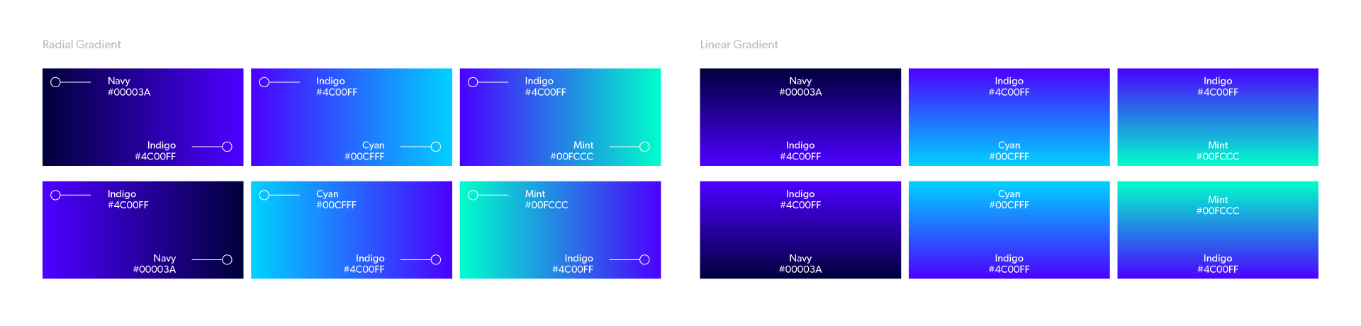
Gradients
Our gradients may be used to highlight key elements or as a full background, ensuring they enhance readability and do not distract from the main content.
To effectively use gradients in our brand system, please follow the examples provided.
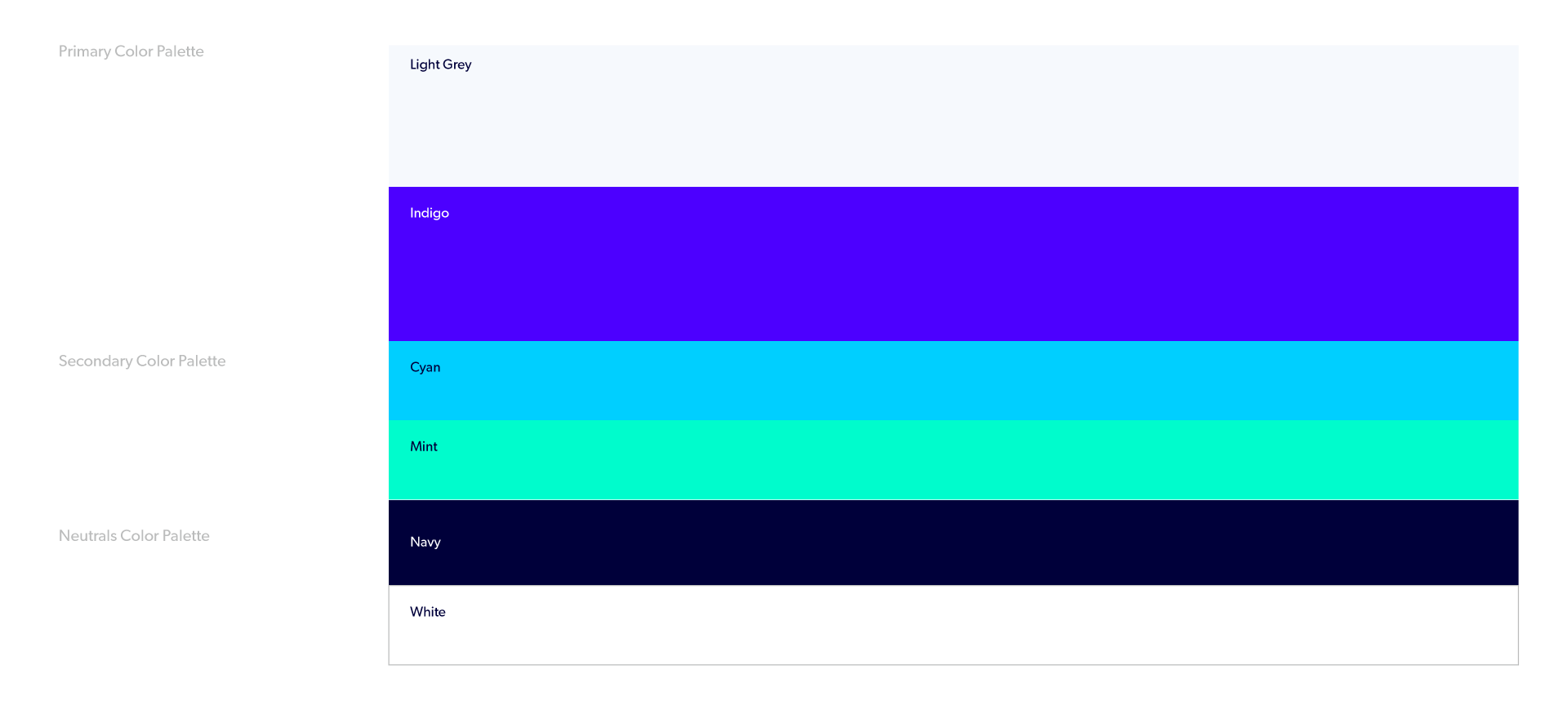
Color Weighting
In order to achieve a consistent look in branded communications, colors should be weighted towards the primary color palette, with secondary color palette supporting where appropriate.
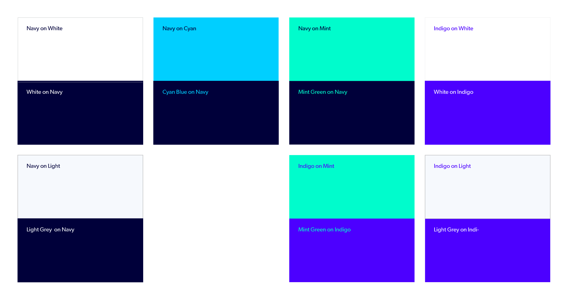
Accessible Color Combinations
Our colors help bring our brand to life, so we should use a variety of combinations to keep it looking fresh. Shown here are examples that should act as guidance on how we can use different color combinations when building creative. Note that we should always lead with our primary color and use other colors from our palette as accent colors. This will allow us to turn the volume up or down on our emphasis.
Color Accessibility
Never typeset Indigo on Cyan or Indigo on Navy.
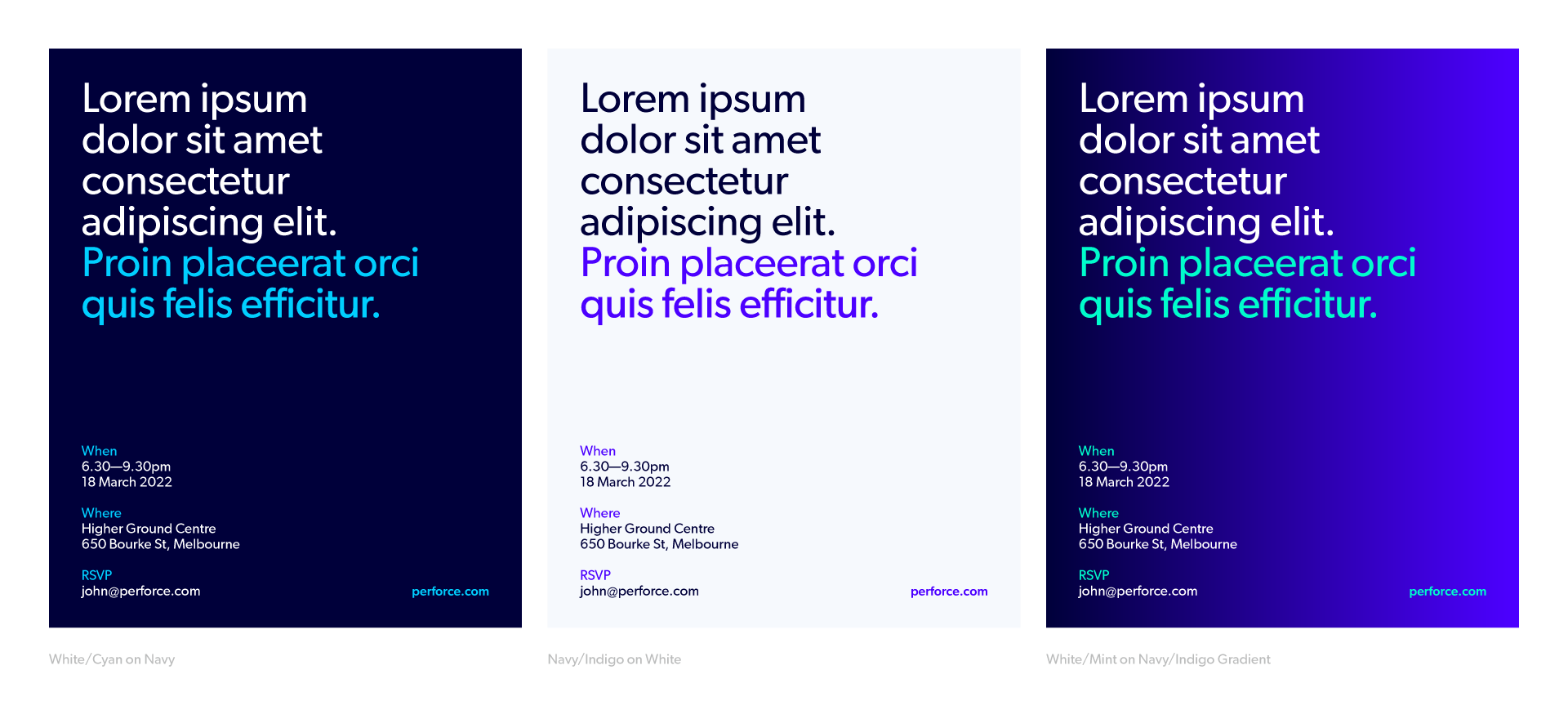
Color Usage Examples
These are examples of how our color palette would be best applied to maintain consistency of look and feel on larger brand initiatives, moments and campaigns.