Guide > Brand Guidelines
Brand Identity
Defining the Brand
Perforce is an innovative leader in the DevOps space, enabling development teams to work more effectively while delivering premium value to C-Suite stakeholders. With a focus on seamless solutions that drive security, efficiency, and superior outcomes, Perforce bridges the gap between utilitarian functionality and aspirational impact. By building a bold yet polished brand identity, Perforce is poised to solidify its position as a comprehensive, solution-driven partner for both developers and decision-makers.
Back to topBrandmarks
The Symbol
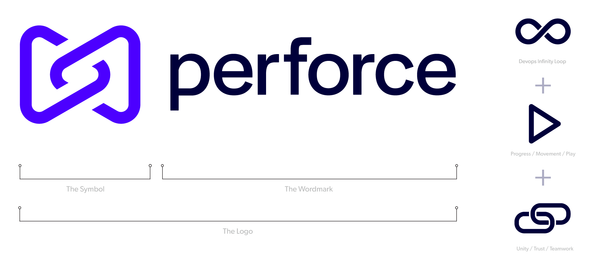
The icon merges three core tenets of the Perforce messaging: the DevOps infinity loop for continuous innovation, arrows that represent progress and play, and links to communicate unity, trust, and teamwork. The intersecting forms embody growth, precision, and seamless collaboration—driving forward a vision of connected, high-performance technology.
The Logo
The Perforce logo combines two key elements: the Symbol and the Wordmark. The Symbol—two intersecting triangles—represents the balance of utility and luxury. The Wordmark, set in Halyard Display (400), is lowercase for a modern, approachable feel. The Symbol and Wordmark should always appear together, maintaining their defined proportions. The Symbol may also be used alone.