Guide > Brand Guidelines
Logos
Logo Anatomy
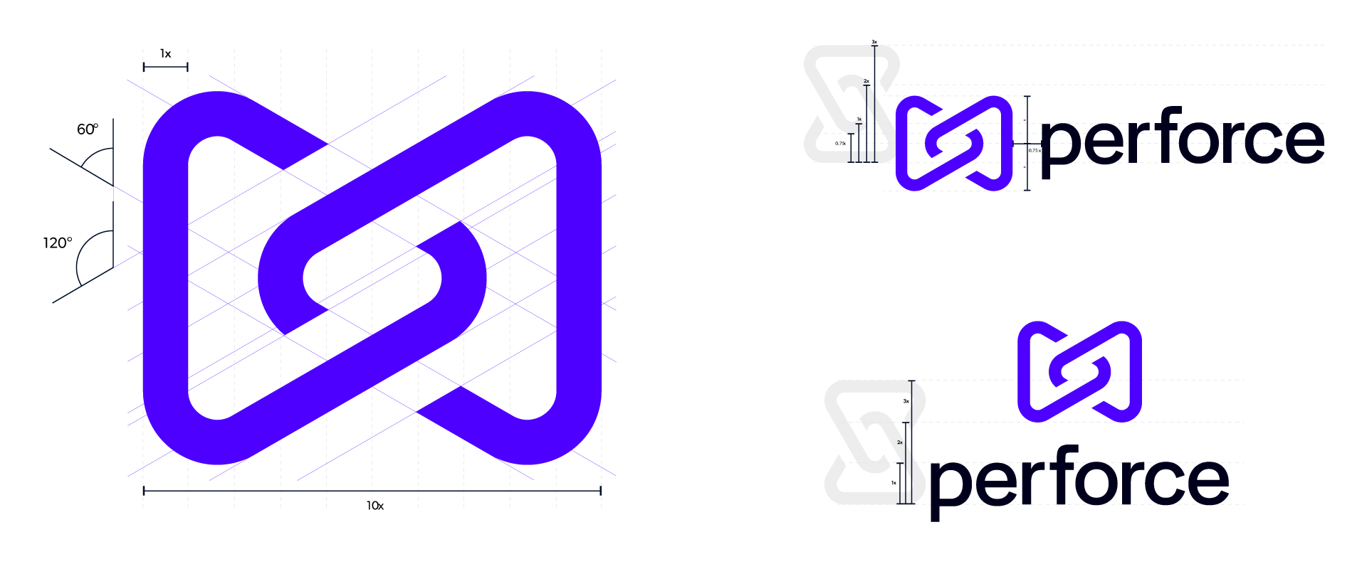
The Perforce logo is a precise and structured design, balancing visual clarity with symbolic depth.
The Symbol
- Shape & Structure: The icon is formed by interlocking, continuous loops that create a seamless and dynamic mark.
- Angles & Proportions: Constructed using 60° and 120° angles, the structure ensures a sense of motion and balance utilizing isometric angles. The stroke width is exactly 1/10 of the total width of the symbol.
Sizing, Alignment, & Spacing
- Proportions: The symbol maintains a defined 3x height relative to key elements, ensuring visual harmony.
- Clear Space: The wordmark aligns with a 0.75x buffer from the symbol to ensure legibility and brand consistency.
Exclusion Zone & Minimum Size
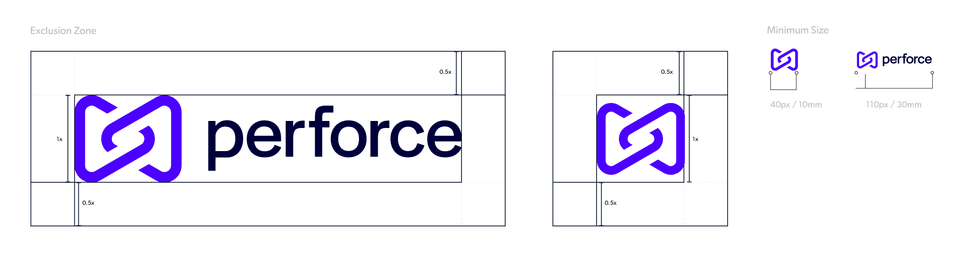
The exclusion zone ensures legibility and impact of the Logo by isolating it from competing visual elements such as text and supporting graphics. This zone should be considered as the absolute minimum safe distance, ensuring the Logo has plenty of room to breathe.
The exclusion zone is equal to half the height of the Logo (marked as x in the diagram).
If you are using the Symbol instead of the logo, the same exclusion rules apply. The symbol’s exclusion zone is half the height of the symbol.
Establishing a minimum size ensures that the impact and legibility of the Logo is not compromised in application. Use the minimum sizes indicated over the page for small–scale applications of the Logo and Symbol.
Logo Misuse
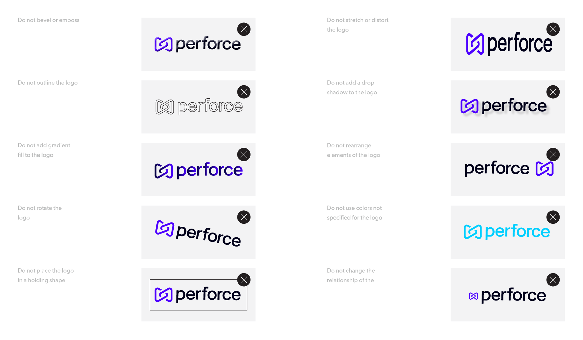
It is important that the appearance of the logo remains consistent. The logo should not be misinterpreted, modified, or added to. No attempt should be made to alter the logo in any way. Its orientation, color and composition should remain as indicated in this document — there are no exceptions. To illustrate this point, some of the more likely mistakes are show on this page.
Logo Color Options
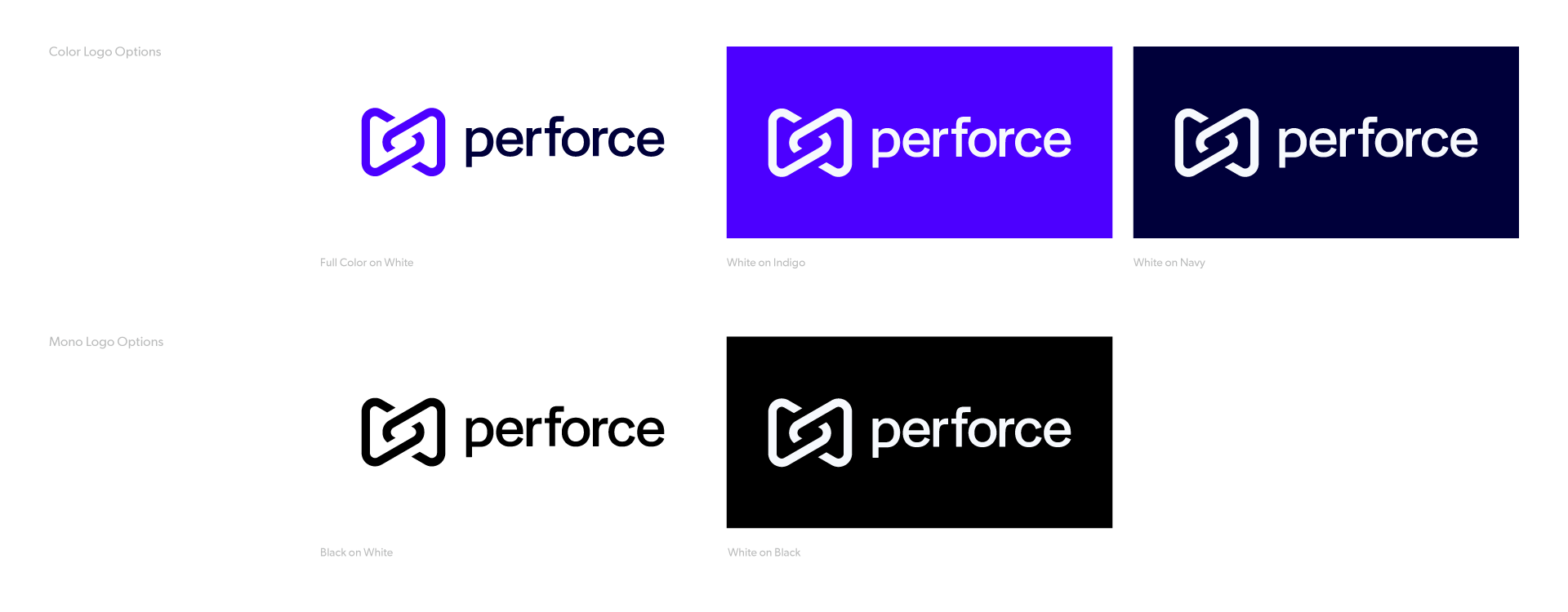
The full color logo, pictured below, is our primary logo colorway.
If color is not an option for technical reasons or if the brand full color logo lacks contrast or competes with other visual elements, use either the black or white logo options.
Download the Corporate Logo
Product Line Logos
Perforce is a portfolio company comprised of individual product lines. These product lines contain sub brands/offerings/features that may have a unique name, however the product line icon remains consistent throughout.