Guide > Brand Guidelines
Typography
Primary Typeface
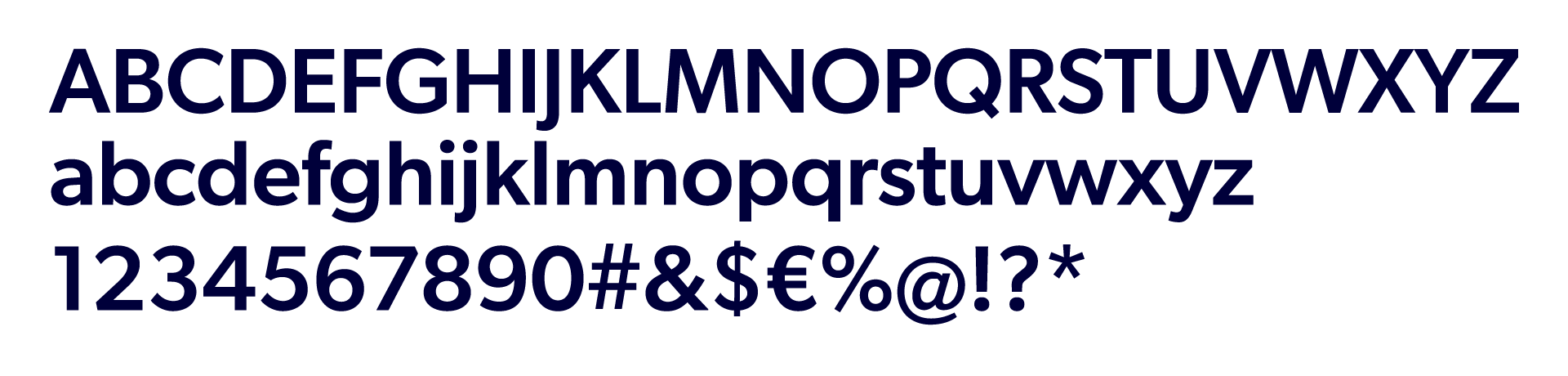
Our primary typeface is Gibson. We use it everywhere possible. It is a simple, clean and legible typeface that compliments our logo. As a sans-serif, it is bold and modern, classic and friendly. It makes an unmistakable statement, and works as functional typography across digital platforms and print materials.
Alternative Typefaces
In situations where it is not possible to use Gibson, Aptos can be used. We only use it when Gibson is not available, such as MS PowerPoint, Word or Outlook. This avoids any incompatibility issues when documents are sent out to third parties who do not have Gibson. It ensures documents are seen as we intend them. Do not use Aptos on professionally designed materials such as signage or marketing collateral like presentations.
Back to topTypeface Weights
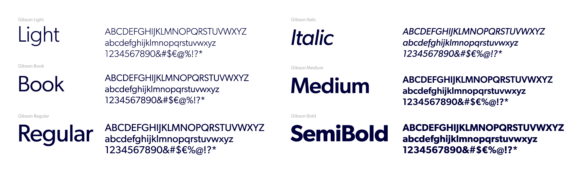
Our brand uses five weights from the Gibson family: Light, Book, Regular, Medium, and Semibold. Such a versatile family offers various solutions from book design to poster design, from brand signage systems and more.
Light and Regular can be used for body text and captions/quotes. Regular, Medium, or Semibold can used for headings. Avoid the usage of Bold except for very select situations.
Type Misuse
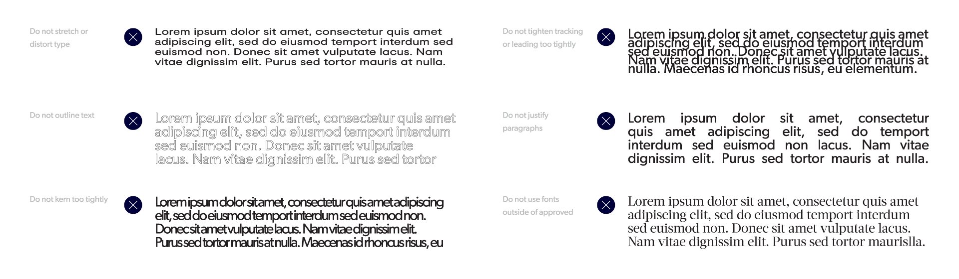
Good typography is extremely important in both internal and external communications. It adds clarity to messaging and instils confidence in audiences. Outlined are some common practices that weaken the powerful effects of typography. When using our typefaces, avoid the following.
Brand + Product Logo Anatomy
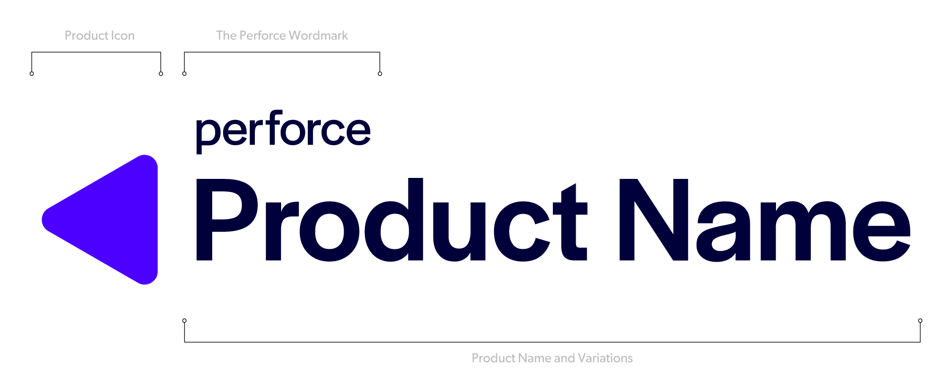
The Perforce Wordmark is set in Halyard Display Regular 400 (modified). Product Names are set in Halyard Display Medium 500 (modified) for consistency with and contrast to the Perforce Wordmark.
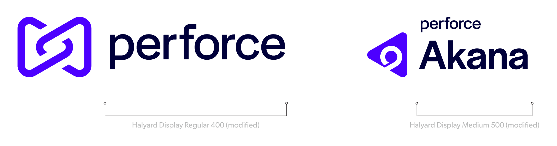
Perforce Product line logos combines three elements: the Perforce Wordmark, the Product Icon, and the Product Name. The Perforce Wordmark is always displayed to reference the company the product belongs to. The Product Icon is always contained within a rightwards- and upwards-pointing triangle, using negative space to represent the product and its function. The Product Name and any Variations are placed below the Perforce Wordmark and to the right of the Product Icon.
The Product Name should always appear with the Perforce Wordmark and the Product Icon, maintaining their defined proportions. The Product Icon may also be used alone.